Monday, July 28, 2014

Afternoon Glow

Kindly click on the image for a bigger view
Title: Afternoon Glow

Medium: Colored pencil, Conte' white and graphite
Surface: Fabriano 160 gsm tinted paper.
Size: 11" H x 8" W.

Status: available.


If interested to own this original artwork, kindly leave a comment here or send a message at my facebook art page or mail at:

dhrubafinearts[at]gmail[dot]com

www.facebook.com/dhrubamazumderfineart

© Dhruba Mazumder, 2014. All rights reserved. Should not be copied, modified, reproduced, printed in any format and size without the prior permission of the copyright holder.

Friday, July 25, 2014

Steel Life

Kindly click on the image for a bigger view
Title: Steel Life

Medium: Colored pencil, Conte' white and graphite.
Surface: Fabriano 160 gsm tinted paper.
Size: 11" H x 8" W.

Status: available.


If interested to own this original artwork, kindly leave a comment here or send a message at my facebook art page or mail at:

dhrubafinearts[at]gmail[dot]com

www.facebook.com/dhrubamazumderfineart

© Dhruba Mazumder, 2014. All rights reserved. Should not be copied, modified, reproduced, printed in any format and size without the prior permission of the copyright holder.

Thursday, July 24, 2014

Fresh Catch

Kindly click on the image for a bigger view
Title: Fresh Catch.
 

Medium: Colored pencil, Conte' white and graphite
Surface: Fabriano 160 gsm tinted paper.
Size: 11" H x 8" W.

Status: available.


If interested to own this original artwork, kindly leave a comment here or send a message at my facebook art page or mail at:

dhrubafinearts[at]gmail[dot]com

www.facebook.com/dhrubamazumderfineart

© Dhruba Mazumder, 2014. All rights reserved. Should not be copied, modified, reproduced, printed in any format and size without the prior permission of the copyright holder.

Wednesday, July 23, 2014

Sketching White on White

Kindly click on the image for a bigger view
.
What's the most mundane subject you have sketched, drawn or painted!? Well, I tried to sketch a white paper receipt that you get in a super market on a white paper [sketchbook] by keeping it on a white paper! There's nothing exciting about this subject apart from the interesting tonal value shapes and nuances in color variations, warm, cool and neutrals. Still the challenge was to keep everything 'white'. I intentionally kept out the superficial details of the printed text on the receipt in the sketch as the main attempt was to study the tonal values and subtle colors.

Medium: watercolor on sketchbook.
Size: 10" H x 6 1/2" W.
Time: 30 min. approx.
Source: Live

 
In the above image, you can see my simple setup for the study of this live sketch. The picture is taken from a similar angle of view from where I was sketching.

www.facebook.com/dhrubamazumderfineart

© Dhruba Mazumder, 2014. All rights reserved. Should not be copied, modified, reproduced, printed in any format and size without the prior permission of the copyright holder.

Monday, July 21, 2014

Floral sketches

Kindly click on the image for a bigger view
I did couple of floral sketches yesterday. Floral sketching/drawing/painting is great for practicing 'negative' way [painting around an element] of painting, specially in watercolor. Probably because most of the flower heads are lighter in tonal values than the leaves and stems they are surrounded by and also the layers of the leaves which creates depths within. It's a challenge to paint in negative way as we mostly think in positive shapes but it is fun and worth practicing. These are done from couple of photographs we took when me and my wife visited the flower show held in last January at Lalbagh botanical Garden, Bangalore.

Medium: watercolor on cartridge paper sketchbook.
Size: 11" H x 7 1/2" W [each page].
Time: approx. 40 min each.
Source: from own reference photographs.

www.facebook.com/dhrubamazumderfineart

© Dhruba Mazumder, 2014. All rights reserved. Should not be copied, modified, reproduced, printed in any format and size without the prior permission of the copyright holder.

Friday, July 18, 2014

Plein Air Painting - Seating stool

Kindly click on the image for a bigger view
This is an old sketch done couple of years back when I had started going outside to sketch more. This is the stool that I carry most of the time whenever and wherever I am going for plein air sketching or painting. This gives me the freedom to choose an angle of view of my choice to paint while seating comfortably unless there's a suitable place to seat down for which I'll have to be really lucky enough. It can be annoying at times to find a perfect viewpoint to sketch but nowhere to seat. Seating on the ground and paint is also not helpful  as the angle of view becomes up giving a weird perspective.

Just to add, this is a good quality camping stool which folds back and can be carried very easily. It's sturdy but light weight with a comfortable seating. It is easily available in sports shops who sells camping gears. There's a comfortable chair also which folds back and made of similar materials.


Medium: Waterproof gel ink pen with watercolor on sketchbook.


Sketching at Lalbagh Botanical Garden, Bangalore
In the picture above, you can see me sketching at Lalbagh Botanical Garden, Bangalore seating comfortably on this stool!

 www.facebook.com/dhrubamazumderfineart

© Dhruba Mazumder, 2014. All rights reserved. Should not be copied, modified, reproduced, printed in any format and size without the prior permission of the copyright holder.

Tuesday, July 15, 2014

Let's Catch a Little Sun - WIP stages explained.

This post is to share the work-in-progress at various stages how the painting 'Let's Catch a Little Sun' was developed in watercolor.
Fig 01
To begin with, a clear tonal value study was done prior the start of the painting to finalize the composition in terms of distribution of light and dark shapes over the available rectangular space, [Fig 01]. The thumbnail sketch needs not to be a detailed one however it should have enough information to be able to use it as a road map to develop the watercolor painting. It helps to reduce any confusion about tonal value placement in the middle of the painting. Based on the value sketch, a very light outline was marked on the water color paper to place the main element. The paper used here was a 300 gsm [140 lb] Fabriano cold pressed paper which has medium surface texture. The paper is securely taped with masking tape on a drawing board.
 
Fig 02
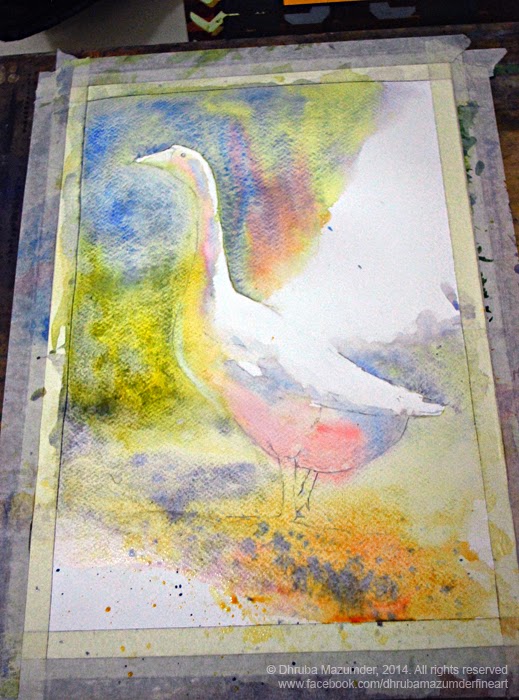
A very loose and juicy wash was laid from the top left corner of the paper letting it flow downward taking advantage of gravity while keeping the board at an angle, [Fig 02]. Various cool and warm colors were allowed to mix and mingle directly on the paper to keep them vibrant and fresh. While top edge of the geese was painted with a hard edge to define the catching light against dark, the bottom portion was painted over the edge and inside to merge with the background. This helps to maintain the play of soft and hard edges at later stages of a painting,

Fig 03

The wash was continued towards the bottom right side including the underside of the geese all in one go to keep soft blending of various colors, [Fig 03]. At this stage it is important to consider the various underlying color placements as they will show through layers of transparent washes later on and will maintain a harmony as well freshness. It is also important to 'preserve' the white of the paper as the lightest value as per the value sketch right from the beginning. Though small portions of the white paper can be brought back to light by lifting colors while it is still damp or even after it has dried, it is very hard to get back to the pure white paper once color is applied and specially if stained pigments are used. Notice the bold splatters towards the bottom portion of the painting. This Simple approach helps to create textures and interest without dominating the main focus.

Fig 04
Once the first wash has dried completely, the 1st layer of dark green foliage is applied again from the top left corner of the paper, [Fig 04]. This layer was also painted with loose brush strokes. The few areas which missed the brush marks conveys some leaves catching light on the dark background. It also helps adding some interest on that big darker shape.

Fig 05
The challenge of this painting was to maintain that sharp light by painting juicy dark pigments without loosing the overall vibrancy of the painting. Also to capture the beautiful and bright reflected light and the form shadow on the white geese without adding much details. Starting from the orange beak, continuing through the head, neck, chest, the feathers through the bright orange legs towards the casting shadow on the ground was painted as a connected shape, [Fig 05]. Care was taken to maintain tonal values and changes of color temperatures. Notice how the feet are merged together with the ground giving the illusion of one single shape.

Fig 06
Added some definitions on the feathers catching light and creating form shadows, underside of the body, the legs and enhanced the cast shadow to balance with dark shape from the top left side of the painting, [Fig 06]. Extra care needs to be taken at these final stages of the painting to avoid over working and keeping off extra brush marks which may ruin the freshness of the painting after the initial hard work.

Fig 07
The dark was enhanced from top left corner towards bottom to create contrast near the head as this is main focal area of the painting, [Fig 07]. Also splatters were added to the bottom of the dark shape to connect with the ground with similar textures. The tone and intensity of the beak was enhanced to capture the back lite effect as well the bright reflected light. The eye was defined and it was time to sign off the painting.

It was a pleasant experience and I hope you enjoyed the stages as much as I did while painting through them. If you have any suggestions, feel free to leave your comments down below. Thanks for going through the post :)!

Medium: watercolor on paper
Size: 13 ½ “ H x 9” W


Original reference picture courtesy by Smitha Shivaswamy. Thanks Smitha.

www.facebook.com/dhrubamazumderfineart

© Dhruba Mazumder, 2014. All rights reserved.

Monday, July 14, 2014

Tinted drawing paper test


I found this tinted cool grey Fabriano, 160 gsm paper sometime back at Landmark store and wanted to give it a try. This A4 size paper has some linear texture and suppose to be for dry mediums like pastel, charcoal, graphite. I experimented here with graphite and white Conte, so far it's working well. Will test some more with other mediums like pen & ink and gouache. You can also notice a swatch of brown Conte on top amongst the other one.


Here's another set of sketches I did on this cool grey tinted paper from Fabriano. I am finding it very interesting to work on the tinted paper as it is forcing me to observe, contemplate and work both in terms of light and dark values while still maintaining as much as possible of the mid values of the paper untouched. I am also finding this a great way of doing value studies than a normal white paper. The top left sketch is my smallest watercolor box. The two windows are sketched from a house nearby.

Medium: Graphite and white Conte' on tinted cool grey Fabriano 160 gsm paper
Size: 11 3/4" H x 8 1/4" W [ A4 ]
Source: Live

www.facebook.com/dhrubamazumderfineart


© Dhruba Mazumder, 2014. All rights reserved. Should not be copied, modified, reproduced, printed in any format and size without the prior permission of the copyright holder.

Sunday, July 13, 2014

Color mixing palette

Kindly click on the image for a bigger view
This is a sketch of one of my color mixing palette that I use at home studio. I loved the simplicity of this one as well as it's mixing wells. The 12 pigment wells hold 4 each of all the 3 primaries colors, reds, yellows and blues of both warm and cool temperature pigments. I am able to mix almost all secondary and tertiary colors out of these 12 pigments. However I try to do only primary mixes on this palette and use another one for the rest. I'll post a sketch of the other palette also someday!


Medium watercolor on sketchbook
Size: Size: 6 1/2" H x 10" W.
Time 60 min. approx.
Source: Live


Kindly click on the image for a bigger view
Above is the list of primary colors marked by their names on my watercolor palette. All the reds, yellows and blues are grouped together. This kind of organized way of putting your colors on the palette [this is not the only way!] helps to pick the color of your choice conveniently without getting into confusion and also allows to compare the hues within themselves. Apart from these colors, I also use Raw Sienna, Burnt Sienna and Viridian Hue.

Kindly click on the image for a bigger view
A picture of the simple setup of the color palette while I was working on the sketch. Adding the color tube on the bottom makes it more interesting. 

www.facebook.com/dhrubamazumderfineart

© Dhruba Mazumder, 2014. All rights reserved.

Saturday, July 12, 2014

Brushstrokes studies in Watercolor

Kindly click on the image for a bigger view
I have been thinking lately to practicing more expressive brush marks while painting with watercolor. Watercolor can be tricky at times and certain results are hard to achieve. In these two quick exercises, the aim was to use the brush directly in a calligraphic way to define forms and not blend too much between the strokes so that brush marks can be more visible giving a textural look. The downside of this may be of showing off too much unwanted marks ending with a feel of overwork. These are done on cartridge paper. The two studies done above are between 5-7 minutes and the colors were put down and let to blend on the paper itself.

Medium: watercolor on sketchbook [cartridge paper]
Size: 11" H x 7 1/2"W


Kindly click on the image for a bigger view

This sketch is done in similar approach with bold and loose directional brush strokes to create marks attempting textural results. Any surface detailing is not the concern of this exercise, instead it's the broken brushstrokes of different values and colors I was looking for to define volumes. On the right are the brushes used for this sketch. The sketching time for this one is 30 min. approx.


Kindly click on the image for a bigger view
In the above image, you can notice the simple setup for this quick watercolor sketch. Keep the subject near the window and pickup the sketchbook and color.

Medium: watercolor on sketchbook [cartridge paper]

Size: 11" H x 7 1/2"W

www.facebook.com/dhrubamazumderfineart

 
© Dhruba Mazumder, 2014. All rights reserved.

Thursday, July 10, 2014

Two versions, Two different approaches


Kindly click on the image for a bigger view

Did these two sketches couple of weeks back. Started the right one initially and while it was taking time to dry the washes, in between started doing the left one too from the same element. Slightly different approaches for both sketches as the left one was started directly with a big brush to define the big shapes with bold and loose strokes. The left one is on cartridge paper while the right one is on Canson C' A grain paper.

Medium: watercolor on sketchbooks.
Size: 11" H x 7 1/2" W [left], 10" H x 6 1/2" W [right]
Time: 60 min. approx for both.
Source: live

www.facebook.com/dhrubamazumderfineart

© Dhruba Mazumder, 2014. All rights reserved.